Reade Blog

Case Studies

Merityre branding roll-out

Car tyre specialists Merityre have multiple branches across the south of England. Reade Signs proved instrumental in the seamless roll-out of Merityre’s new rebrand. Adaptability and Flexibility: Key considerations when rolling out a rebrand across multiple premises The Brief A consistent brand is important for any business, especially when that business has premises spread over a wide geographical area. And it’s made more complicated if you want a modern, unifying look for a variety of different premises types and shopfronts. This was the challenge Reade Signs faced when car tyre specialists Merityre asked us to rebrand most of their 21 sites across southern England. We needed to take the newly adopted brand style that Merityre had implemented and apply it as part of a rolling update plan for their designated branches, taking into account any local restrictions or conditions. The Solution Our first step was to survey every branch, to take measurements, photographs and to check any access issues. We then had to visualise the new brand, with its bright, yellow theme, into the survey pictures and make any necessary changes for the client to approve. Once we had approval, the next step was to get the designs through the planning permission process. This needed a lot of background work by us to make sure that both our clients and the local authorities were happy. Once everything was in place, we could move on to the next phase, the actual production and installation of all the signage. We had to source a single stock of self-coloured aluminium composite material (ACM) to guarantee consistency of the “Merityre yellow” branding across all locations. Once we produced and labelled the signage, we had to coordinate the installation of every sign with the individual branch managers to minimise any disruption to their daily operation. Finally, the products were dispatched with installers on a pre-planned route to reduce travel time between sites and keep costs down. “Reade Signs proved instrumental in the seamless roll-out of our rebrand…their knowledge and attention to detail was second to none and we felt we were in expert hands from beginning to end. The signage across our branches stands as testament – it looks absolutely fantastic and we are so pleased with the finished result” Dene Arnold, Merityre General Manager

Read More
Case Studies

Reaching for the Sky

A bespoke project recently completed in West London proved no job is too big or too high for the Reade Signs team The Brief We were asked if we were able to fabricate and install 56 coloured PVC mesh banners around a brand new multi-storey car park in West London. Oh and by the way, the banners are almost 20 metres in height and up to 7 metres wide and there are just 6 weeks to complete the works. This was a truly mammoth undertaking. We had to build the aluminium frames on site in the middle of winter – no two banner frames were the same size or colour. The frames and banners were fitted using teams of abseilers, and to top it all – the car park was in use 24 hours a day throughout the project. The Solution A detailed project plan was key here as there were so many elements to bring together. The structural calculations, drilling templates and fabrication drawings had to be signed off prior to site works beginning and working areas had to be cordoned off and agreed to ensure the safety of our work force, the general public and the car parks users. Happily we achieved all our objectives, the only hold ups were a few days of high winds where the abseil teams couldn’t work safely. The end product is simply stunning and a testament to what can be achieved with the right team, meticulous planning and an unswerving belief that we could get the job done. The end result is stunning turning a car park into a major talking point from all vantage points. The client is delighted with the end results and complimented the team on their tenacity and dedication to execute the project in such a professional and smooth manner. “We’re very pleased with how the car park is looking. Great job. Thanks!” Nick Green, Property Manager

Read More
Case Studies

Reade Signs HQ Makeover

When Reade Signs underwent a rebrand, it was Reade HQ that was most in need of a make-over. It was essential for the building and surrounding areas to project the inspired, innovative and established feel behind the rebrand, and to reflect Reade Signs’ culture The Brief In the space of five years, our workforce had grown considerably, the car park was bursting at the seams, and the branding had started to date. The office space needed to be utilised in a more efficient and effective way, and both the building and branding were in need of reviving. With Reade Signs approaching 36 years in the business, and undergoing a complete rebrand, a launch party had been arranged to celebrate this combined achievement. It was essential the new building reflected the quality and class of Reade Signs’ culture, evoked and inspired both visitors and staff alike, and was ready in time for the launch party. The Solution Time and effort was invested during the planning stage that involved in-depth evaluation and discussion regarding the customer and staff experience at Reade Signs, with comprehensive building and grounds assessments. With the help of www.crucialprojects.co.uk the Reade Signs building was transformed to a welcoming, vibrant and inspiring environment. It is now an engaging, pleasurable and inspiring experience to visit Reade Signs. The car park has plenty of additional allocated space for visitor and staff parking, and the entrance is striking and bold. The welcoming reception incorporates a comfortable seating area with an interactive Smart TV, and a stairway featuring the striking Reade Signs wordwall leads into the stunning showroom. The gigantic sample boards are a real talking point, and the space is admired by all that visit. Above all, Reade Signs’ new branding has a strong and prominent presence throughout.

Read More
Case Studies

CYC:D Fitness Studio

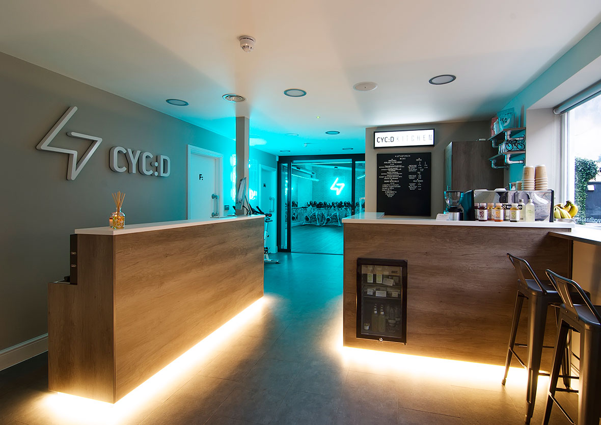
CYC:D (pronounced psyched), is a new concept in fitness. A modern, stylish and inspiring boutique fitness studio with its first opening in Haslemere, Surrey The Brief CYC:D asked us how they communicate their individuality to customers and make them want to keep coming back for more. With very specific ideas about the design and feel of their studio, their wish-list included expensive bespoke illuminated light boxes, traditional tiling in the shower and washrooms, and a 3D brick-effect wall finish in the main gym, which wouldn’t be able to be fixed to the already sound-proofed walls. There was also a strict launch day, and like all our customers, they required us to work harmoniously with their timetable and around other suppliers. The studio was already live and working whilst the interior and exterior signage was to be fitted. The Solution Reade Signs provided full consultancy from the beginning with a designated Project Manager, taking charge of the project coordination and tailoring the signage to the customer’s needs and visions with the best use of materials. We were able to advise how the customer’s ideas and designs could be adopted for the public environment and adhere to health and safety legislation. We designed and commissioned alternative solutions to the desired expensive light boxes that created the same effect – at a fraction of the cost – using our extensive network of reliable connections developed over 35 years in the business. Our team were also able to suggest further opportunities for branding in the shower and washrooms that hadn’t been considered and saved money over traditional tiling. The brick effect panels we recommended gave a fantastic finish to the studio and required minimal fixing to preserve the noise barrier. The customer was fully informed of the process from start to finish and was delighted with the finished product, which was installed and completed ahead of the launch day deadline. We appointed Reade Signs to produce and install all of our internal and external signage at our new boutique fitness studio, CYC:D, in Haslemere, Surrey. We had really specific ideas for some of the signage and we worked closely with Pete Merrifield who provided expert advice on the most appropriate materials and finishes to ensure we got the exact finished product we were looking for. Nothing was too much trouble and we are extremely happy with the resulting work. Reade were also able to assist with the required artwork and provide great advice on what could and couldn’t be achieved. They ensured everything was ready to go for our opening and were mindful of working around our customers when we had opened. Installation was quick and expertly handled and we are extremely pleased with the quality of the signs. We would not hesitate to use them again. Faye Walton – Director CYC:D

Read More
Building Signage
Case Studies

Vanarama new corporate HQ signage

Reade Signs were recently signed up by the sponsor of the England National Football League to promote their new corporate headquarters The Brief A winning team: Reade Signs helps promote football’s National League sponsor’s new HQEstablished in 2008, commercial vehicle leasing company Vanarama outgrew their original premises and recently moved into larger headquarters in Hemel Hempstead. They wanted to make an impact with a big refurbishment programme to let everyone know they’d arrived, so they asked Reade Signs to create the signage for their new HQ. We recognised that the new signage had to express more than Vanarama’s branding, which they’d been successfully promoting through their sponsorship of the English National Football League. They wanted to publicise their new headquarters. Our brief was to turn a tired, unattractive and unwelcoming building into a bright new office headquarters that would feel welcoming not only to customers but to staff and suppliers too. The Solution Vanarama operates long hours, seven days a week, so illuminated signage was a must. However black lettering features heavily within their logo and this is always difficult to light up. Our team has years of experience in sourcing the best materials and we found a specialist acrylic that appears black in daylight but changes colour, in this case to white, when illuminated. And we used rimless letters to ensure a crisp, clean look both by day and night, ensuring the whole face is illuminated. Vanarama also wanted to make a big statement with a five metre high monolith. Such a large structure required planning permission and structural engineering drawings for the foundations, as well as a detailed electrical plan. We applied for all the necessary planning permissions as part of our project management service, taking care of all the details and difficulties so our customers don’t have to worry about any of it. In this instance, the monolith had to be built in several sections at our factory and this lets our client update their messaging quickly and cheaply. We were even able to make a design feature of the jointing, lighting that up, too. In addition, Vanarama also has a back-illuminated bus shelter-sized poster case on both sides of the monolith allowing them to promote special offers, show when they are recruiting or even to congratulate the League winners at the end of the football season!

Read More
Office rebranding at Broadgate Quarter
Case Studies

Office rebranding at Broadgate Quarter

Reade Signs were asked by London-based branding firm Socrates Communications to work with them on the rebranding of Broadgate Quarter – a landmark building in the heart of London’s newly fashionable East End The Brief Broadgate Quarter: Refurbishing in the heart of LondonThe 10-storey office block was undergoing a major refurbishment so we were expecting some artistic, innovative and technical challenges within a tight timeframe – and that’s exactly what we got. We were given a comprehensive brief: Remove the original stainless steel letters from a marble wall and clean it up Fit a large (2.9m x 1.9m) glass directory back onto the marble Apply floor graphics and stunning digital wall murals Apply a striking, toughened 2.9m x 1.9m painted back glass and vinyl directory. The Solution Removing the old letters from the marble was difficult and left some visible holes across an area around three metres across. These all had to be filled to match the contours of the original marble. On top of that, due to the weight of the glass, we weren’t happy just relying on the fixings to hold all of the weight in place. After a bit of careful consideration, Reade’s installation manager and his team used their technical background and experience to excellent effect with a bit of on-the-spot problem solving. Their solution was to design steel bars across the fixing holes to counterbalance the weight of the glass. The artwork was approved by the client on the Wednesday evening of the job, leaving us just two working days to upload and prepare the artwork ready for printing. We supplied the digital mural artwork on the Thursday morning, and the first installation was done on the Monday evening. More than 230 metres of digital wall vinyl was printed, turned around and fitted within two working days! But it was worth it – the walls have a striking appearance with a radical graffiti design across the building’s 8th and 9th floors – not only serving the purpose of standing out from the crowd but ultimately, selling the space. Reade Signs were tasked with providing exterior signage and window manifestations at 9 Appold Street as well as printing and installing wall and complex floor graphics over two floors for the building launch.The exterior signage installation was challenging and required a fair amount of planning plus the deadline for completion of the project was extremely tight which necessitated working after hours. Reade Signs completed the work on time, as per quote which they have done for all the projects they have undertaken for us and we would happily recommend them for similar projects. Bambi Montgomery – Head of Special Project, Design & Production, Socrates Communications

Read More
Case Studies

Game, Signs and Match

The Reade Signs team revelled in the opportunity to manufacture and install a vast array of signage for this prestigious pre-Wimbledon tennis event The Brief Game, Signs and Match – Aegon Classic Tennis Tournament, BirminghamThe Reade Team were tasked to prepare the tournament’s advertising, hospitality and event signage including directional signage, banners, score-boards, ticket office signage, umpire chairs and court advertising, and efficiently install it whilst the club was still in use by members and VIP players. It was paramount all artwork was compatible for television, and with major sponsors being secured up until the very last minute, this was a task in itself! The Solution The Reade Team worked openly with event organisers The Lawn Tennis Association and all sponsors to ensure a seamless and prompt installation, and met each deadline in a timely manner. Meticulous attention to artwork design and colour detail was essential, as were thorough site surveys, and a complete understanding of the tennis courts’ perimeter advertising system.

Read More
Case Studies

‘Flash Sale’ Marketing Suite Up as Quick as a Flash

Reade Signs had four and a half days to manufacture and install a temporary marketing suite on the third floor of the old ‘Comet’ Head Office building in Hertfordshire The Brief The property developer was holding a ‘flash sale’ on a suite of apartments imminently and as such required temporary marketing suite signage that included printed wallpaper, freestanding units (all made from scratch), wall-mounted imagery and cladding of old, poorly ventilated elevators…all within the space of four and a half days! The Solution The Reade Sign’s project team immediately got to work researching, designing and manufacturing the products and materials, and worked closely alongside the installation team to ensure the project was executed smoothly and efficiently in the limited time frame. The client was delighted with the look of the marketing suite and impressed with the extremely quick turnaround.

Read More
Case Studies

Axis: Urban Styling

Reade Signs was tasked with creating a modern, ambient and chic marketing suite to drive immediate sales following a major launch event. The Brief A major regeneration project, ultra-modern apartments, and the marketing suite needed to reflect this and drive immediate conversions from their launch event. The Solution The Reade Signs team designed a centrepiece neon sign for the AXIS logo and hung it directly behind the main sales desk. Overall we created many pieces to compliment the chic environment, including a slick iPad driven interactive plot finder system.

Read More
Howarth Homes Uxbridge
Case Studies

Marketing New Homes in Uxbridge

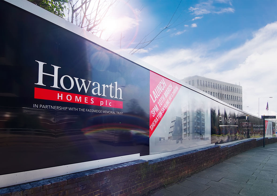
This was an exciting challenge to produce and install a striking hoarding clad with large sections of illuminated text and logos The Brief To maximise the potential of site marketing, the client wanted an eye-catching site hoarding design that had large sections of illumination. A key requirement was the ability to update the signage as the development progressed. But a prominent street location meant we should take into account reducing the potential for malicious damage. The original timber hoarding had significant variances in height, had not been designed to accommodate any form of illumination and had no provision for the supply of power. The Solution A design was developed following a detailed survey of the hoarding to make sure that the rises and falls were taken into consideration. We than manufactured printed panels which were routed out to accept opal acrylic inlays for the logos and text. The acrylic was back-lit using super-bright LEDs, which provide great reliability, are low maintenance, and are far more economical to run than fluorescent tubes. Falling prices have made these more cost-effective and they are now our recommended option for most applications of this type.

Read More